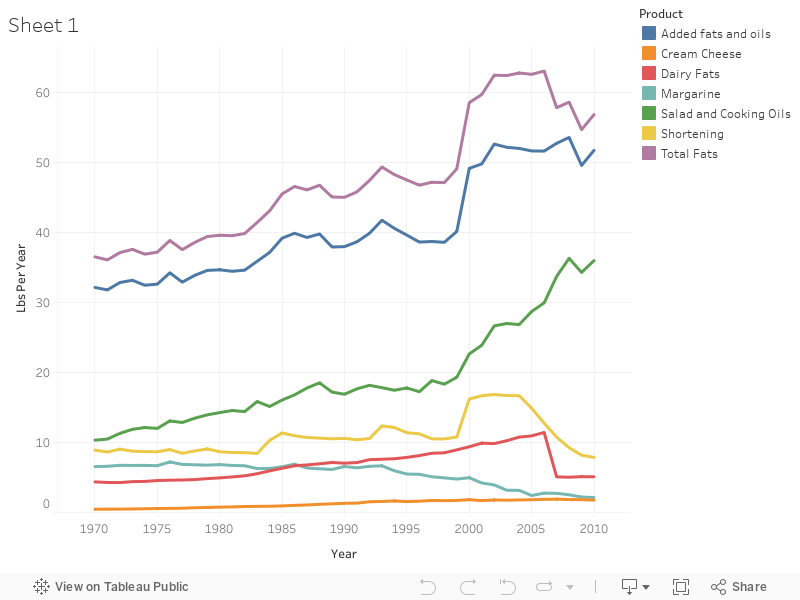
This graph is useful in displaying the information about how Fats and Oils have been consumed over the years. There are different products that contain certain Fats and Oils and this shows the few examples, such as margarine and cream cheese. The collected data is based on the actual consumption by people minus the waste from scraps. This line graph shows a nice comparison about how the intake of Fats and Oils has increased since the 1970s, which properly portrays how the overall culture is consuming food. Along with this increase of Fats and Oils is also the increase of industrialized food, which makes sense because industries are more efficient and produce product faster. Therefore, there is more product for consumers to eat.
